Week Ten: Creating the Brochure
Week Ten: Creating the Brochure
Drafting and Graphic Design
This week, I spent most of my time working on the creation and drafting of the History Harvest brochure, editing and tweaking my work from previous weeks to fully hone in a solid draft to present to administrators and professors at UCF. My main time constraint was the continuous mix of some sections having too much content, and some sections having too little content. This was especially evident as the graphic design aspect of the brochure was laid out, making each section's need for downsizing or upsizing apparent.
Early Drafted Designs
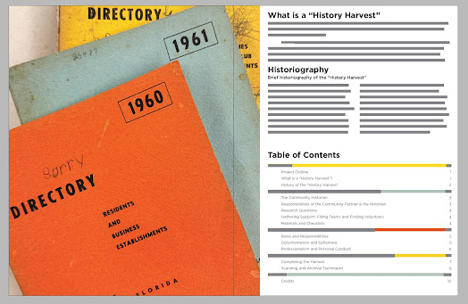
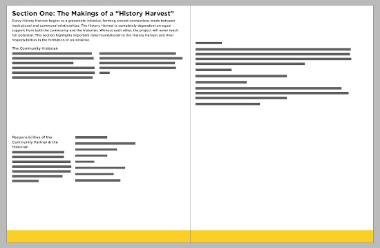
Below you will find some concept designs of the first few pages of the History Harvest manual. Each photo is simply a screenshot of the editing software used and does not depict the true quality and resolution of the document; Please click on the photos to enlarge them. This past week, I made amazing progress on the final realization of my work this summer. This coming week, I will continue to work to offer the best demonstration possible for the Summer Internship Showcase.
 |
| Cover Page. Draft. |
 |
| Table of Contents, Definition of the History Harvest, and brief historiography. Draft. |
 |
| Section One in a very early design. Early concept. |
Miscellaneous Work: Editing and more Editing
Despite my advancements on the brochure itself, I filmed a brief foreword with Dr. French this week to help introduce the model early on. My hope is that by putting a video before the table of contents, viewers and participants of the model will personify the work early on, understanding the History Harvest's base characteristic: collaboration. By doing this, students, faculty, and other community partners and institutions will be greeted and welcomed into the model, encouraging them to enjoy the work and learn from it. I spent this week editing the video, working on it before moving on to other major parts of the brochure.


Comments
Post a Comment